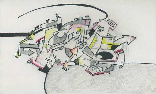
Calligraphy: Graffiti: "Jim"
Graffiti has been an influence on my calligraphy in general, which I try to keep in my personal style, but I'm interested in getting good at traditional graffiti as well.
Some wonder why taggers (graffiti artists) make lettering that is not readable. I like one response I read, that compared it to a bird song. You can appreciate the beauty without being able to understand what the song means. Likewise, you can learn to appreciate the formal aesthetic properties of the piece without knowing what it says. In my calligraphy in general, I try to use the letters as a jumping off point, an inspiration, for a composition. The point is not, particularly, to make something for someone to read. In fact, I find that if people have no trouble reading something in a work of art, they often stop looking. I think it's because they feel like after they've read what it says, they've understood the work as much as they need to. Obfuscating the letters encourages one to look longer, to try to work it out.
This reminds me of a recent article I read that shows that viewing strange, surreal art encourages learning.
References:
Martinez, S. (2009) Graff: The Art and Technique of Graffiti. Impact, Cincinatti, OH.


Comments